

Higher Logic
Multi-site merger and redesign
Higher Logic is a SaaS company that provides online community solutions for a wide range of organizations. Over the past 15+ years, their offerings have grown to include three distinct products: Higher Logic, Thrive, and Vanilla. Each serves unique audiences with overlapping needs—but their digital presence didn’t reflect this evolution.
As the company scaled, its product structure and brand strategy became complex, resulting in a fragmented online experience. Their websites lacked clarity, cohesion, and were not effectively guiding either prospective or existing customers.
Role:
UX Lead
Activities:
Digital ecosystem unification
Workshop facilitation
User archetype and journey mapping
Information architecture and sitemap
Tree testing
Wireframing and prototyping
Moderated usability testing
The Challenge
How can we merge Higher Logic, Vanilla, and Thrive websites under one cohesive digital experience, and serve diverse audiences with clarity and simplicity?
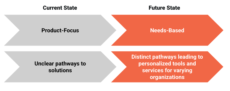
The core UX challenge was to simplify and unify a multi-brand ecosystem without losing the distinct value propositions of each product. The existing sites were product-heavy and difficult to navigate, offering little education on who each product was for or why it mattered.
We needed to rethink the entire experience architecture to:
Merge three separate product sites into a unified experience
Create clarity around product offerings and use cases
Serve vastly different audiences, from association executives to B2C marketers
Shift from product-centric to needs-based storytelling
Discovery & Research
We kicked off with in-depth discovery workshops to align with stakeholders and understand business goals, audiences, and product differentiation. Our research efforts included:
Virtual Discovery Workshops with internal stakeholders and cross-functional teams
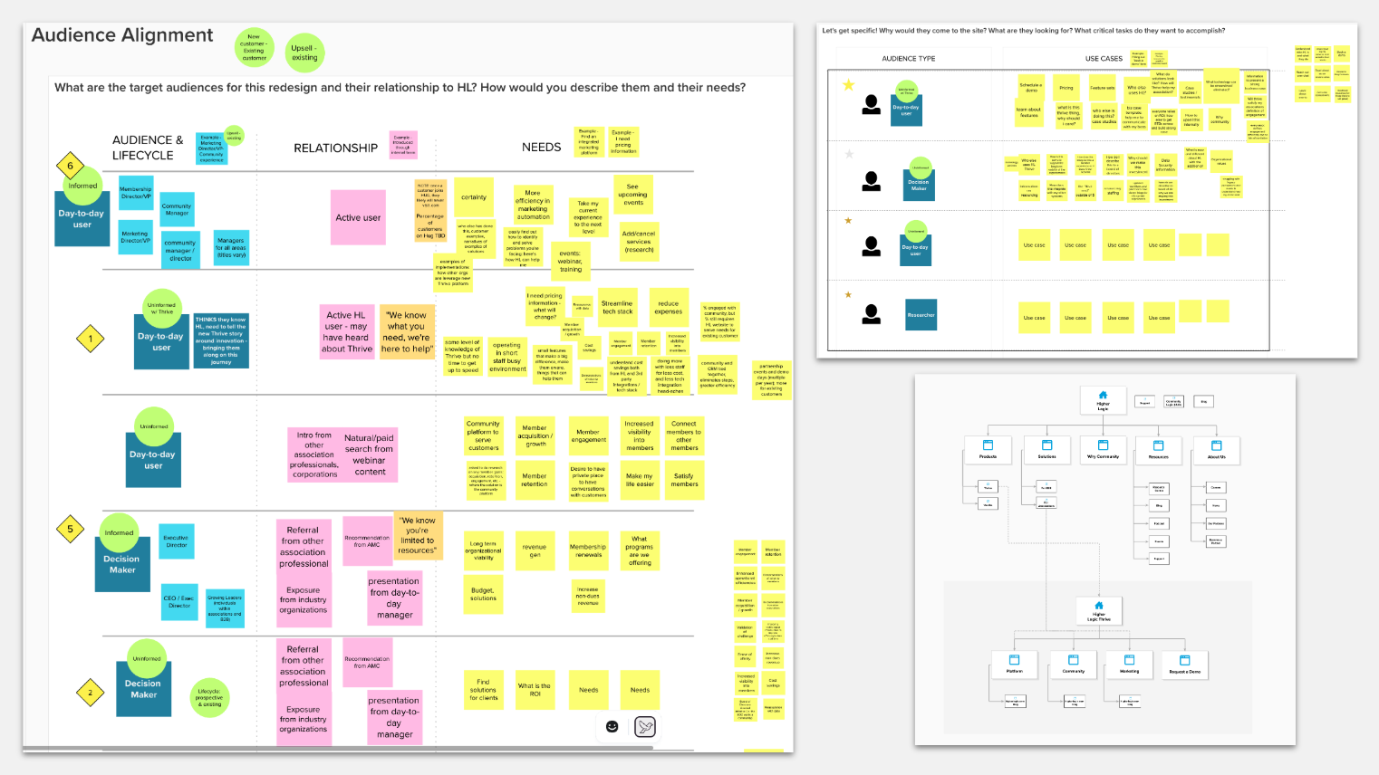
Audience & Use Case Mapping
Usability Testing on existing sites
Stakeholder Interviews across departments
Competitive Analysis of top SaaS and community platforms
→ Discovery workshops
I facilitated collaborative workshops to uncover business priorities, audience pain points, user needs, and feature requirements. These sessions helped us align on a strategic direction and identify gaps in both brand perception and product clarity.
Alignment workshop
Align on overall direction, strategic approach, and goals for the Higher Logic, Thrive, and Vanilla website shifts
Being identifying what success looks like
Uncover what the key stakeholders think about the current site and what they envision for future state
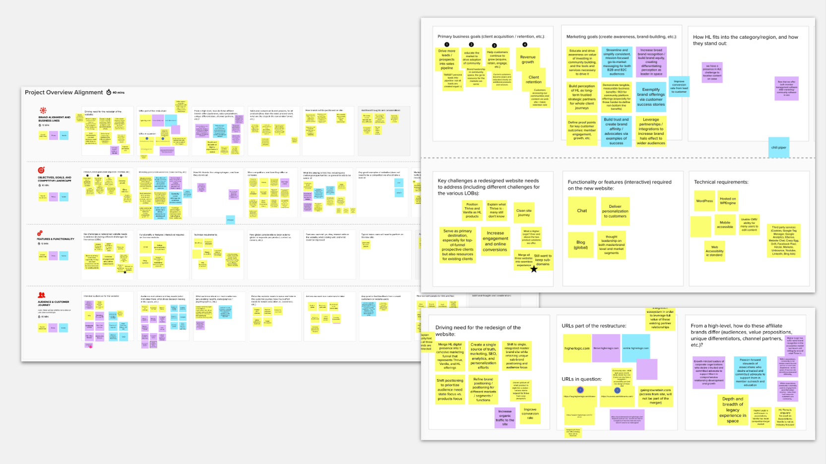

Align on audience types from Thrive vs. Vanilla, and understand why they might be coming to the website
Identify need states, challenges, and use cases to help the team determine how to satisfy unique user journeys
Collaboratively identify gaps and opportunities in the current sitemap across the current primary and product websites
Audience needs and use case workshops
→ Usability testing and interviews
To gain deeper insight into how the website supports both prospective and existing users, I conducted a series of qualitative usability tests and customer interviews as part of the discovery process.
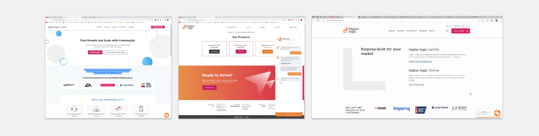
Usability testing sessions were held with non-customers familiar with community platforms. These participants were asked to complete tasks on the existing websites to observe how they navigated the content, interpreted the offerings, and understood the relationships between Higher Logic, Thrive, and Vanilla. This helped us identify key confusion points around product positioning, brand hierarchy, and language.
In parallel, I interviewed existing customers to learn how the current website supported their research and decision-making processes, and how it functions (or falls short) in their ongoing experience as users. These conversations helped us understand what information builds trust, which content drives value, and where the site could better support long-term engagement.
→ Competitive evaluation
Building on the competitor landscape identified during our discovery workshops, we conducted a focused evaluation of brands within the community management, marketing, and sales tech space. Our goal was to analyze how other key players structure their digital experiences—what works, what doesn't, and what might inform our own approach.
We selected a representative set of competitors that demonstrated compelling examples of website functionality, content strategy, and user engagement. This evaluation allowed us to identify common patterns in how similar companies present their offerings, guide user journeys, and communicate value propositions. We paid close attention to navigation models, messaging clarity, product positioning, and how effectively these brands moved users toward meaningful action.
These insights helped us clarify opportunities for differentiation and informed several strategic decisions throughout the redesign—particularly around simplifying complex offerings and creating more intuitive pathways for users.
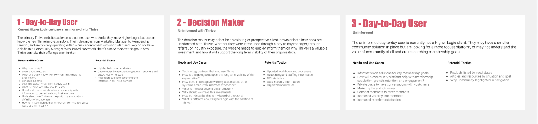
Discovery takeaway
We identified three core audience groups—each with different levels of familiarity with community solutions. We expanded these into detailed archetypes, outlining:
Roles & responsibilities
Pain points
Community knowledge level
Platform expectations
Key motivations and success metrics
This revealed a crucial insight: many prospective users didn’t even know “community software” was what they were looking for. We had to build a bridge from their real-world problems to the platform's offerings—through intuitive journeys and relevant content.
UX Strategy & Execution
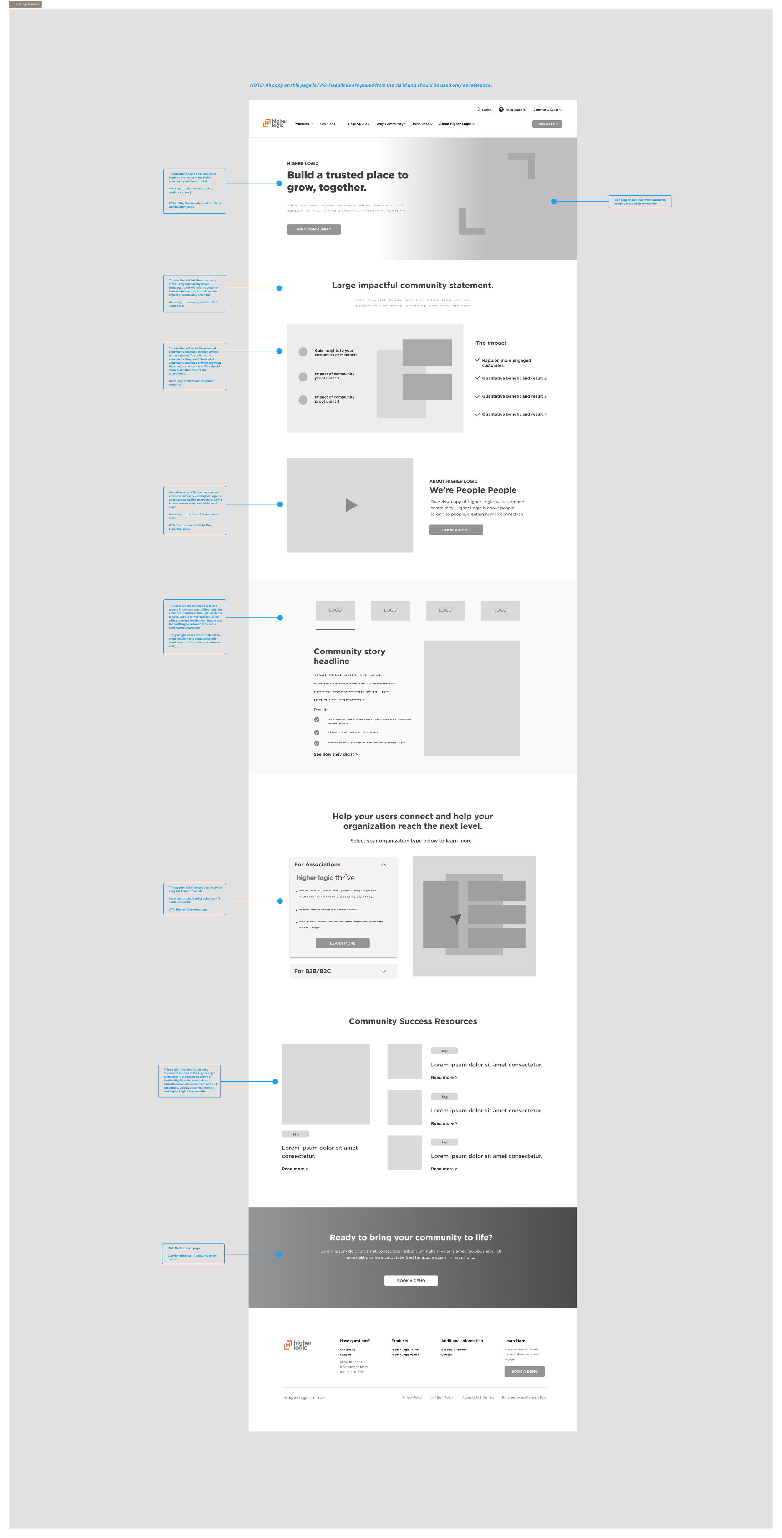
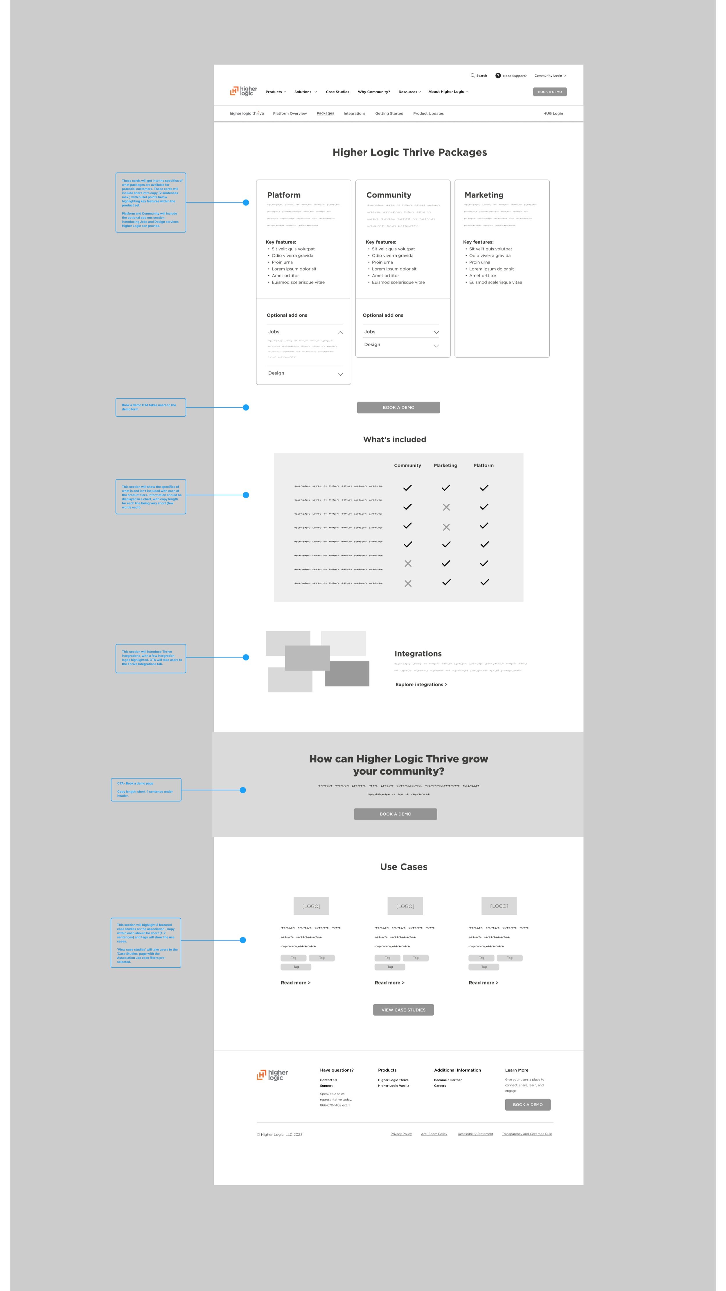
Based on insights, we developed a new information architecture and navigation system to better serve users by:
Organizing content around needs and goals, not just product features
Enabling easy cross-navigation between product lines without losing context
Providing clear entry points for each audience segment
Designing a homepage and top-level pages that establish brand credibility and educate users
Key deliverables included:
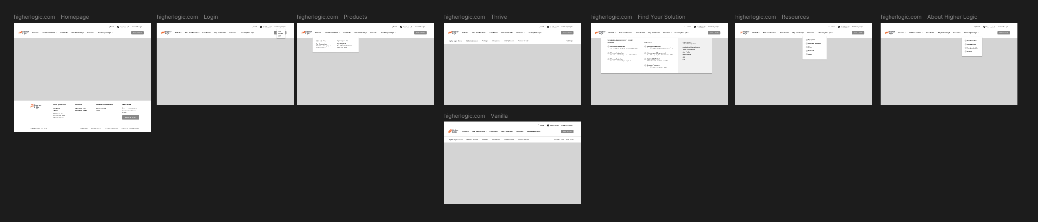
Unified Sitemap and Information Architecture
Iterative tree testing to validate navigation verbiage and organization
Role-based and knowledge-level user flows
Wireframes templates with embedded content strategy
High-fidelity UI designs consistent with the refreshed brand direction


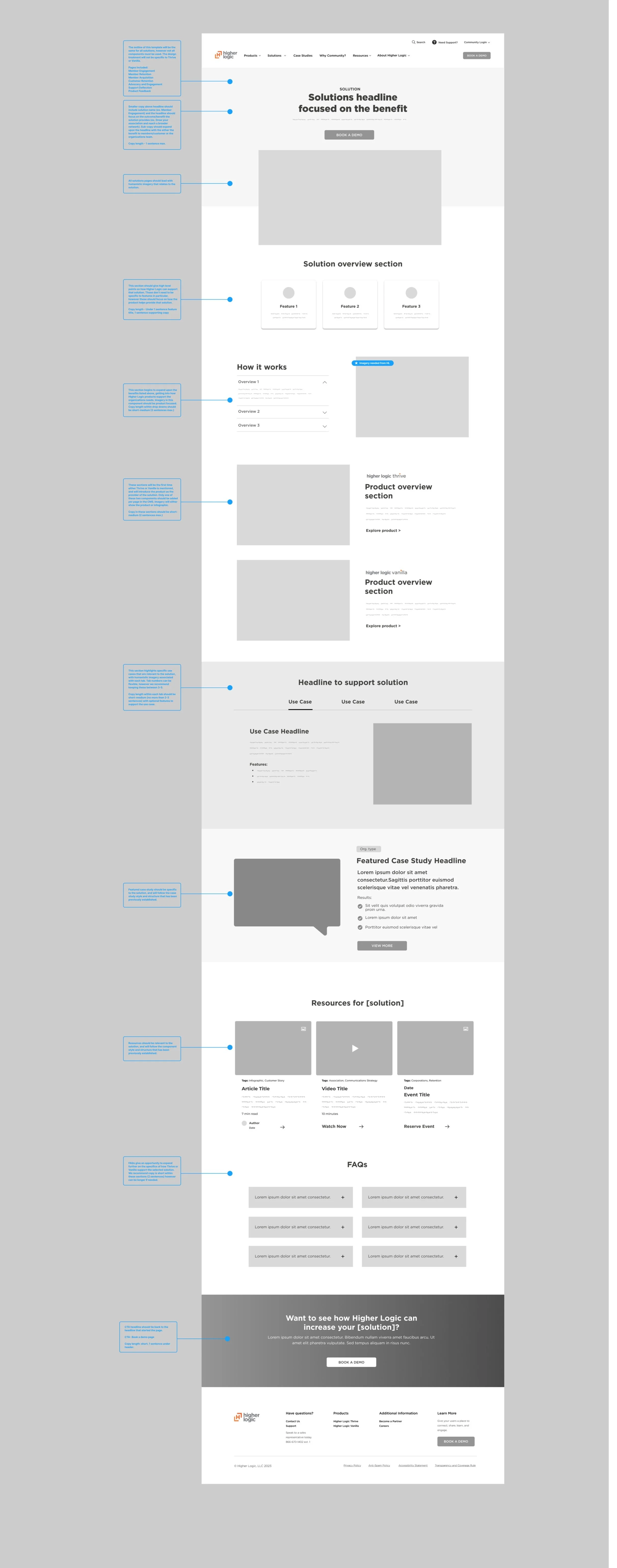
High-fidelity design and copywriting
Bringing the final website to life was a collaborative effort between UX, visual design, and content strategy. I partnered closely with designers and copywriters to translate our research and early concepts into a polished, production-ready experience.
Our discovery findings and usability testing provided a strong foundation for decision-making—shaping everything from tone of voice and visual language to the use of interactive elements, case studies, and video content. Together, we ensured the site reflected a more human, engaging, and needs-based approach, grounded in real user expectations and behaviors. The result is a cohesive digital experience that balances clarity, personality, and functionality across all three brand domains.
Project outcome
The redesigned experience allowed Higher Logic to:
Present a cohesive brand story across all products
Improve engagement and reduce bounce by surfacing relevant pathways
Equip users with the information they needed to make confident decisions
Lay the groundwork for future scalability and personalization
Reflection
This project was a deep dive into solving for complexity—not just through visual design, but through strategic information architecture, cross-functional collaboration, and a relentless focus on audience needs. It challenged me to balance multiple brand identities while crafting a seamless, intuitive digital experience that meets users where they are.
Ongoing improvements
After launching the redesigned website in late 2023, we continued to iterate and refine the experience based on both internal feedback and evolving user needs. Continuous improvement was a key goal from the start, and we remained committed to testing and learning post-launch.
In late 2024, I conducted a round of usability testing on the live higherlogic.com site to evaluate how real users were interacting with the new experience. Participants were given light scenario-based prompts, but the primary focus was on observing natural behavior across key user journeys. These sessions offered valuable insights into how prospective customers navigate the site, what resonates with them, and where friction or confusion still exists.
The findings directly informed updates to content structure, navigation clarity, and interaction patterns—ensuring the website continues to evolve as a responsive, user-centered experience.
